Aim – Visual analysis of the Album of the Cover
Ideas / Subtitles: Connection between music and cover, use of composition, use of light, meaning of different elements
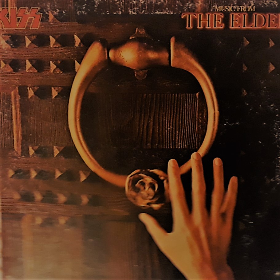
Specific: THE ELDER – It represented a radical new departure in terms of Album Cover Designed
At the beginning of the 80s LPs were very important as was the cover on the front and inside which aroused impactful emotions on music audience.
As a Hard Rock fan and having a predilection for the KISS, one day, strolling through the streets and looking at the shop windows I noticed a big and famous music shop in my own city who had also displayed in the larger front window an LP which was attractive to my eyes, a lot more than the rest of the LPs they published since their career launch and the follow-ups in which they mainly showed their own characterful and unique masks. I asked the shop assistant to show me the “Music from The Elder” LP to look into the front image and the inside one (being a double-cover). And the inside image and some notes increased my interest a lot
I purchased that Album and listening to the music I realised that it was in line with the subliminal messages of the cover further emphasised by the highly captivating notes inside the cover.
Imagery Analysis
I invite you to stare at this first image. The first thing we see is an ancient front door belonging to the medieval age, as in castles or temples, made up of the thickest wooden boards, metal seams to support the wall-structure and furthermore studded for defensive purpose. At the centre of the image there is a metal ring and an ornamental rose at the base of the ring, close to it a thin and partially enlightened hand and wrist.
Behind this picture is highly visible the great work of the Design Staff. They have used their imagination to help themselves to come up with a campaign product. The idea conceptualiser or the photographer had the intention to convey the idea to the viewer. The reward is whether or not the viewers actually have got what it is that the idea conceptualiser wants them to do. So, basically we can look at three different things that conceptual advertising might be trying to do. Firstly, it might be trying to tell us something about the product or a place or the brand. Secondly, it might be trying to entertain us. And the third thing it might be trying to do is share some kind of value statement through the advertising.
Specifications underneath
We find all these three things in the LP cover image thanks to the photographer and the graphic designer. For a photographer, it is vital the knowledge of focal length-opt/lenses, and in this case he uses a wide angle shot so that he has all the information of the product, brand, and story.
In fact, on top of the LP cover we have the name of the music band (the brand) at one corner; on the opposite one we have the Title of the LP (value statement).
The rest of the Cover Image tells us a story to entertain us. The way the ancient front door is showed in the picture is obtained by an Image Technique called “The rule of third” in which, especially, we draw attention to the hand which is going to pick up the metal ring, furthermore it creates a sort of harmonious feeling emphasising also the surroundings
Colour
The colour attracts our view( as in the hand and the bronze-yellow metal ring) then we have the brown – vintage of the front door and to that end, not to be overlooked, the name of the music band and title of the LP in red enlightened to create its own impact.
Light
The light is also important as the colour. The photographer use “soft light” to create an intimacy, a sort of homey feel to the photo.

The Back cover, as shown above, is a continuation of the Front Cover, furthermore we notice the list of songs and the name of the producer (really important, I will mention further why this is important) which are in yellow, the size of characters (writing) is little but readable.
In addition, looking more into the position of the list of songs we get into the story of the product emphasising interest.

In the image above we have the Image technique called “Symmetry”, by this we are creating a photo about calmness and peacefulness and also creating shapes of both sides so that the viewer attention is drawn into the middle area, because of the characterful candlelight at the centre of the table.
Light
In this picture we have “warm light” technique, we are talking about warm colours (which tends towards more red, orange, magenta), and just around the candlelight the colours give us a sense of calm.
Other important features
On the top of the image above we notice a little short story (written by Bob Ezrin, famous music producer as for this LP too) divided symmetrically on both sides of the cover that intrigue all the viewer to read it, furthermore it coherently matches with the whole image of the album and introduce the list of tunes highlighting them.
Listening to the music the listeners will be encouraged to be embraced by the enchanting music tune sequences as those in a great musical.